Shift 1(2020)
Shift is a concept project. In this project, I wanted to propose a new way to use dual-sim devices. Currently, dual-sim devices account for 42% of all smartphone sales. This is an increasing trend. And not just Android, but iOS devices are supporting it, so why do people use dual-sim devices? People had a desire to distinguish work from personal life. Therefore, it was often used to separate work numbers from personal ones. For example, the main number was used for task purposes and the secondary number was used for private use.

However, the current experience of dual-sim has no other special function than providing two numbers for one device. Also, the user's usability is not divided because there are two numbers but only one home screen. Lastly, there is a problem that it is difficult to tell which alarm came from which number.
So I wanted to distinguish between two modes. I thought that each usability should be somewhat distinct, as users use two numbers. So I separated the home screen into two and distinguish the style of the alarm by each number. Furthermore, widgets are also provided for best use of the two modes.
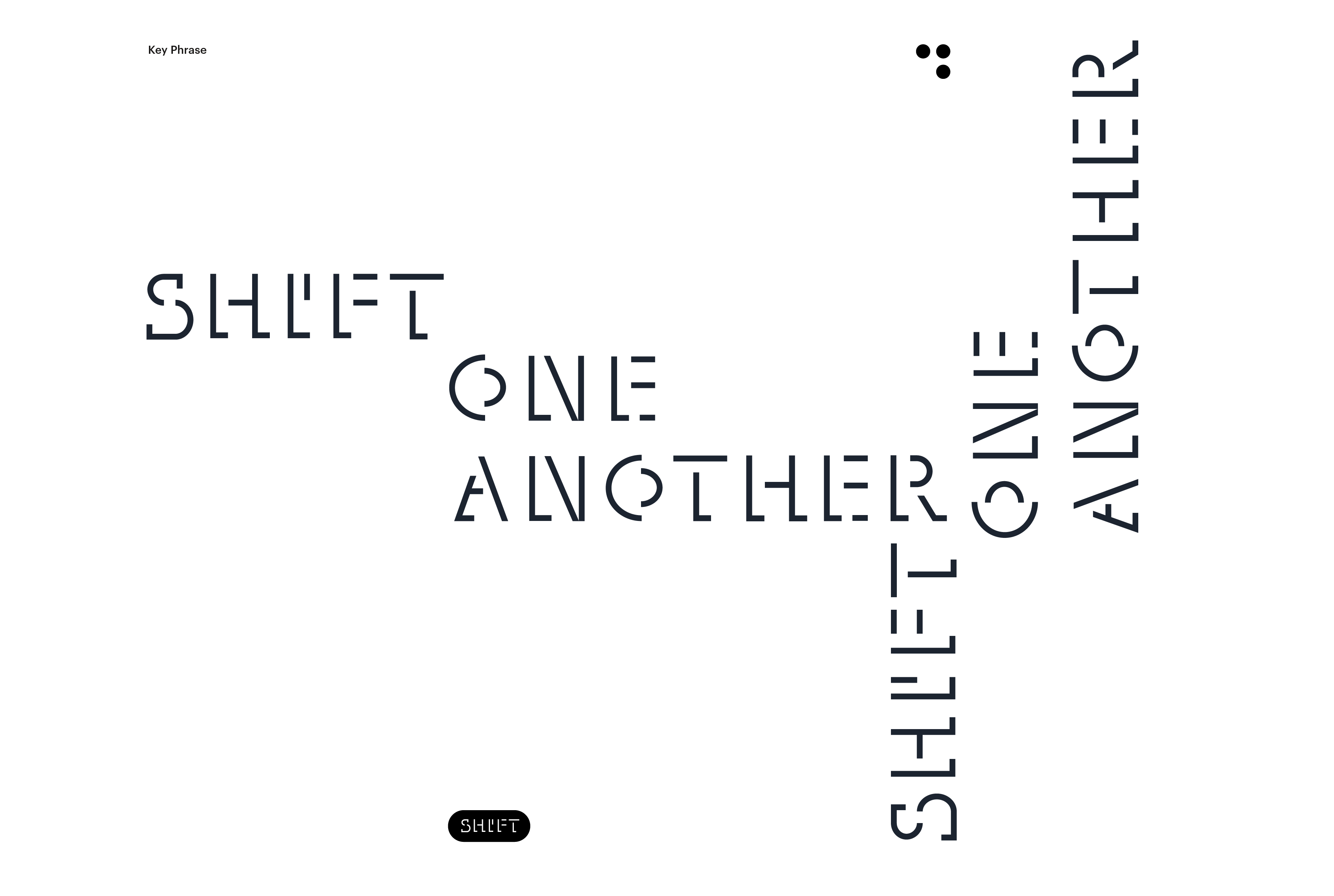
The main concept of the launch is ‘Shift one another’, because the usability of this launcher, which uses two modes shifting, is the most important function and characteristic of the service. There are two modes, but rather than using them at once, I thought it would be more useful to shift one another when needed.
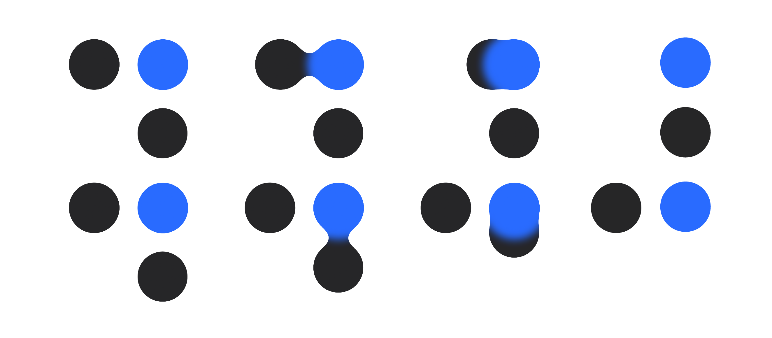
The most important visual languages that distinguish between the two modes are horizontal and vertical. The horizontally drag-and-drop is to enter Task mode, and vertically into Private mode. This interaction is also used as a characteristic graphic of this service.
The most important visual languages that distinguish between the two modes are horizontal and vertical. The horizontally drag-and-drop is to enter Task mode, and vertically into Private mode. This interaction is also used as a characteristic graphic of this service.
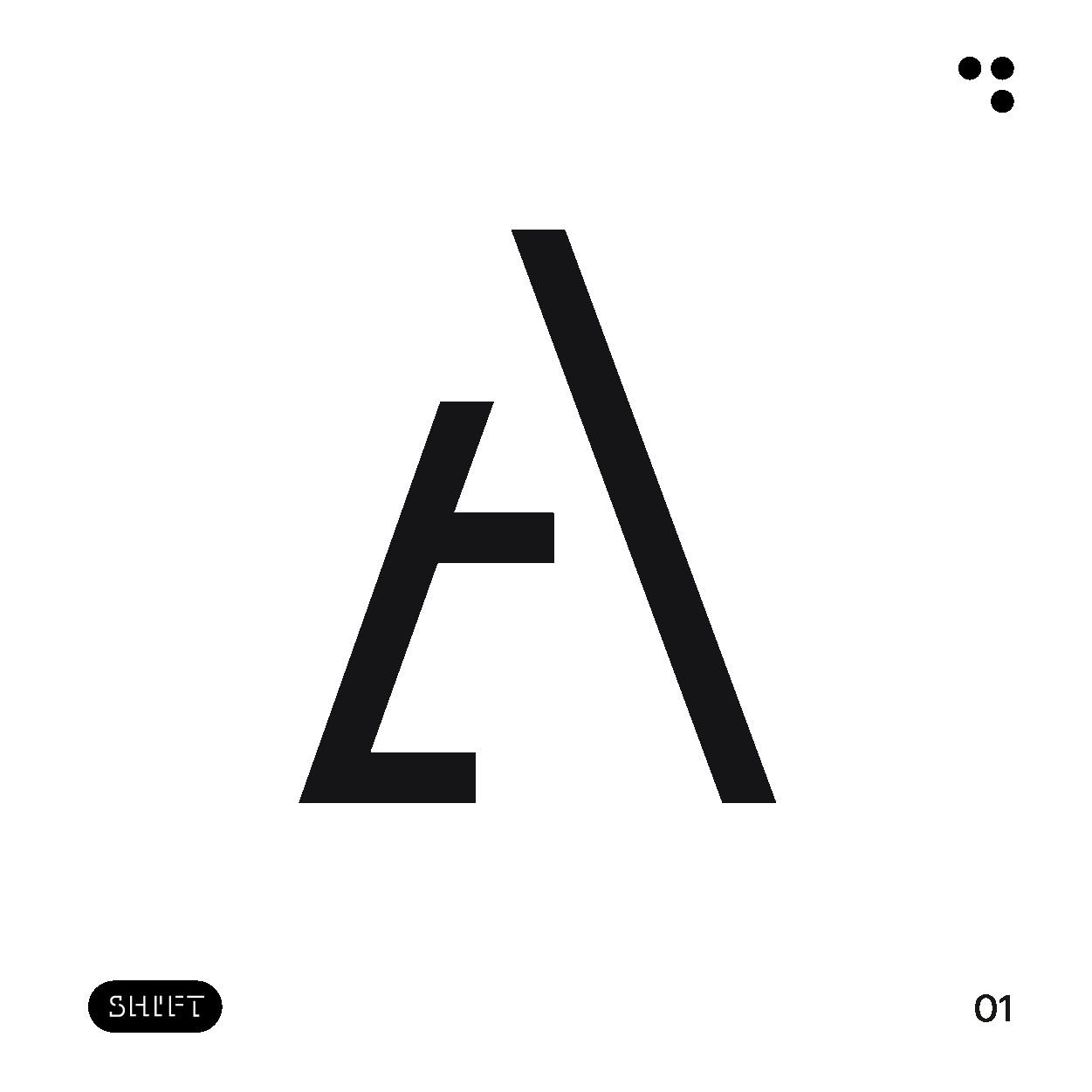
I wanted to extend the feature of this service, which uses only one, not two modes at a time, to the font design. Only one part of the letter was lit up, leaving the other part of the letter omitted. The font was intended to be used for brand promotion, advertising, and so on so that the service's branding language can be established.


Horizontal and vertical graphic elements and brand typeface can be used for promotion and various applications. In addition, the service slogan 'Shift one another' has been applied in various ways. The slogan was intended to be placed horizontally and vertically to indirectly express the characteristics of the service.


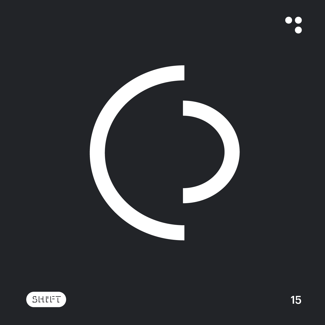
Along with the brand font, the UI icons were also designed in the same mood. This icon is found throughout the service. It is applied to alarms, phones, messages, mode initials, etc.