Typography book
그래픽 디자인에 있어서 타이포그래피는 필수적이며 가장 중요한 부분입니다. 인쇄 형식과 서체의 레이아웃 등 타이포그래피는 당대 기술의 발전과 직접적인 관련이 있습니다. 수많은 서체들은 시간이 지남에 따라 기술에 따라 끊임없이 변화해 왔으며, 디자이너들은 특정한 목적이나 상황에 맞게 타이포그래피를 조합하여 선택해 사용해 왔습니다.
When it comes to graphic design, typography is a prerequisite and the most important part. The character layout in the design, i.e. the formatting and typography for printing, are directly related. Various types of typography have constantly changed with technology over time, and designers have combined and chosen them to suit specific objects or situations.
타이포그래피에서 어떤 서체를 선택하느냐, 어떻게 배열하느냐에 따라 의미 전달이 쉬울 수도 있고, 의도한 목적과 다르게 전달될 수 있습니다. 그렇기 때문에 글자의 형태가 어떻게 진화해 왔는지, 어떤 목적에 의해 만들어졌고 어떠한 기술이 바탕이 되어있는지를 알아야 합니다. 저는 이 책에서 고대부터 현대에 이르기까지 기술에 의한 타이포그래피 개발이 어떻게 진행되었는지, 그리고 그 특성이 사회에 어떤 영향을 미쳤는지를 묶어 정리하였습니다.
Since semantic transmission may be easy depending on what type of typeface you choose and how you arrange it, or it may differ from the intended one, we should know how the form of letters has evolved according to technology. In this book, we look at how the development of typography by technology was carried out from ancient times to modern times, and how its characteristics affected society.

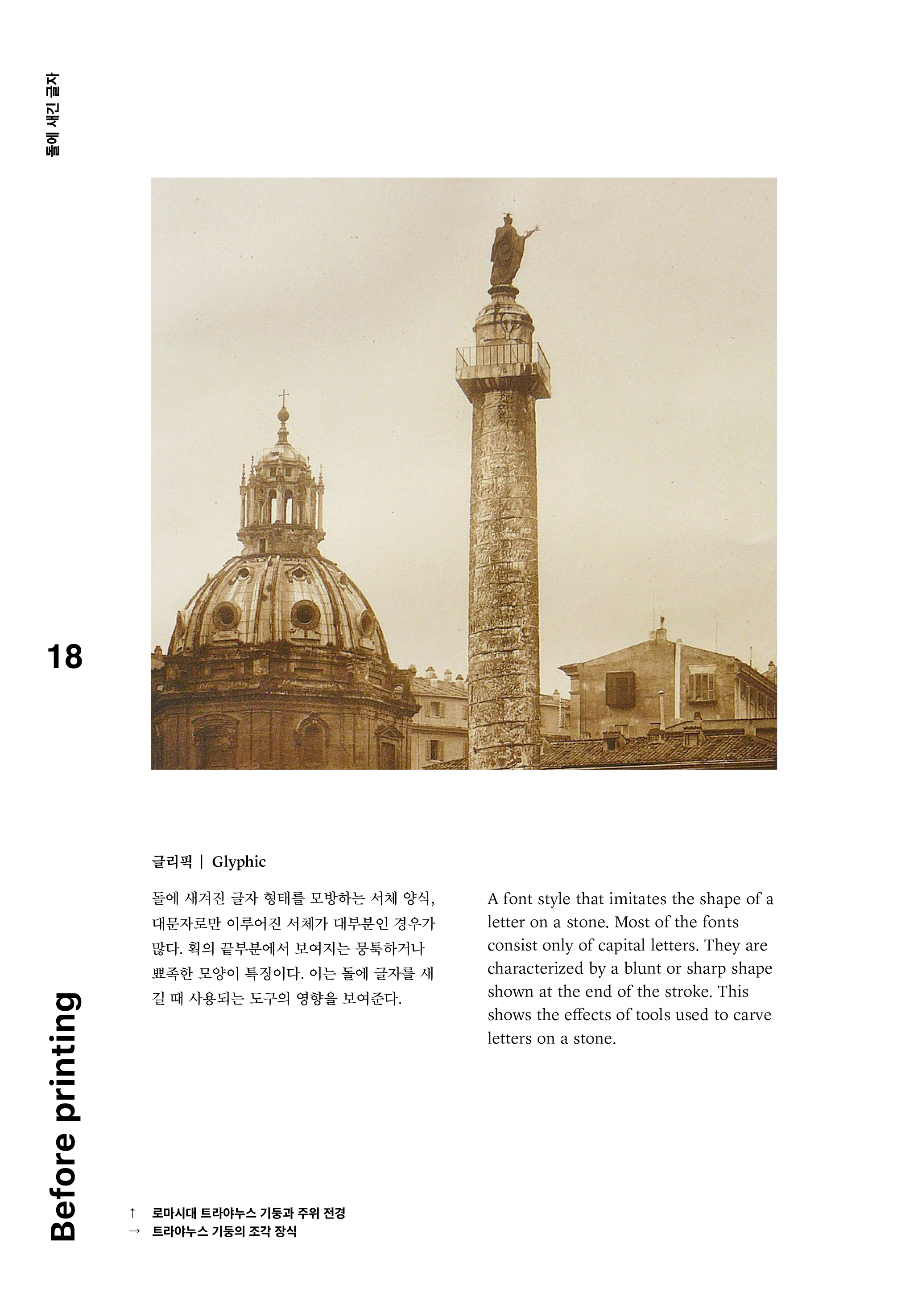
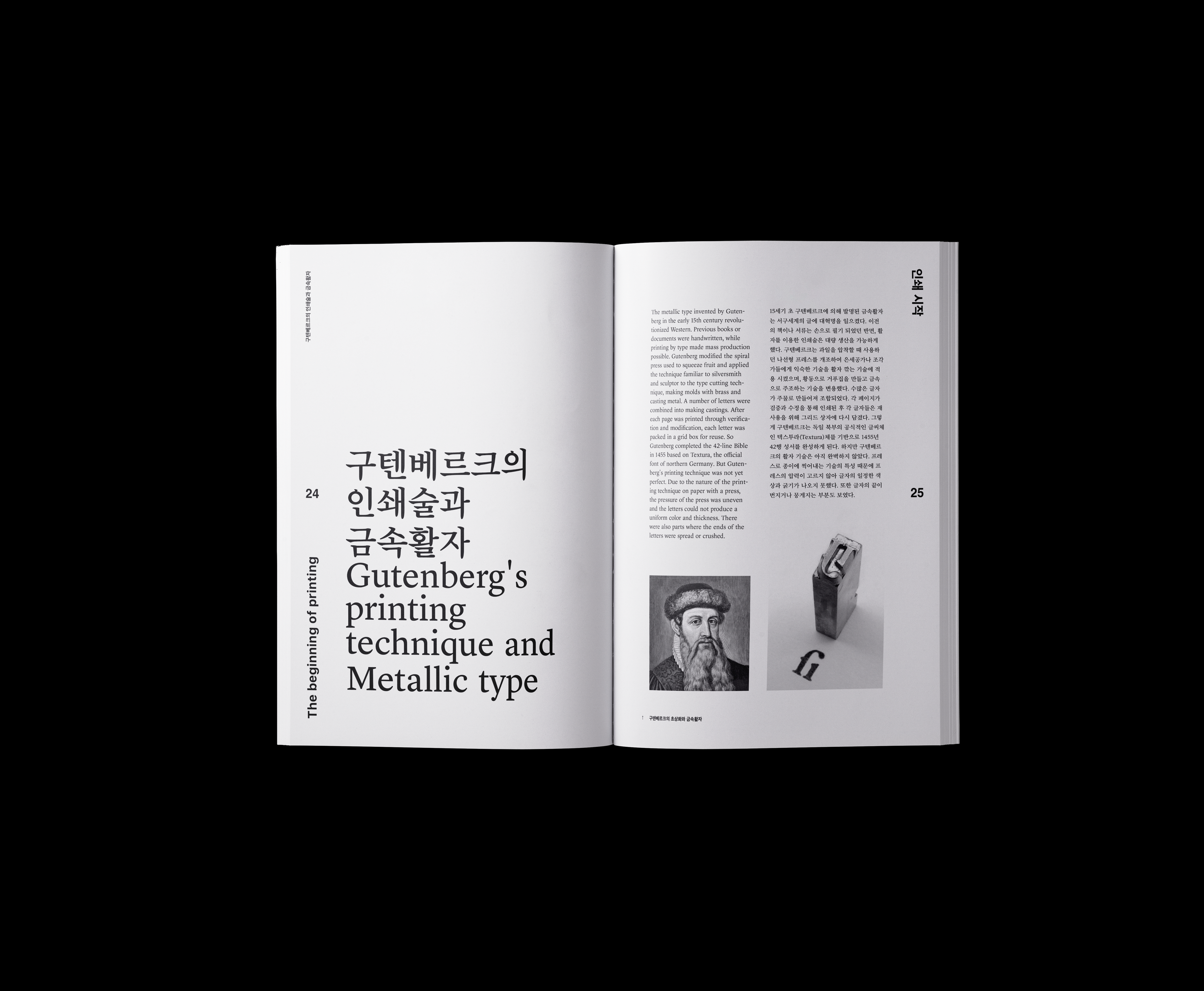
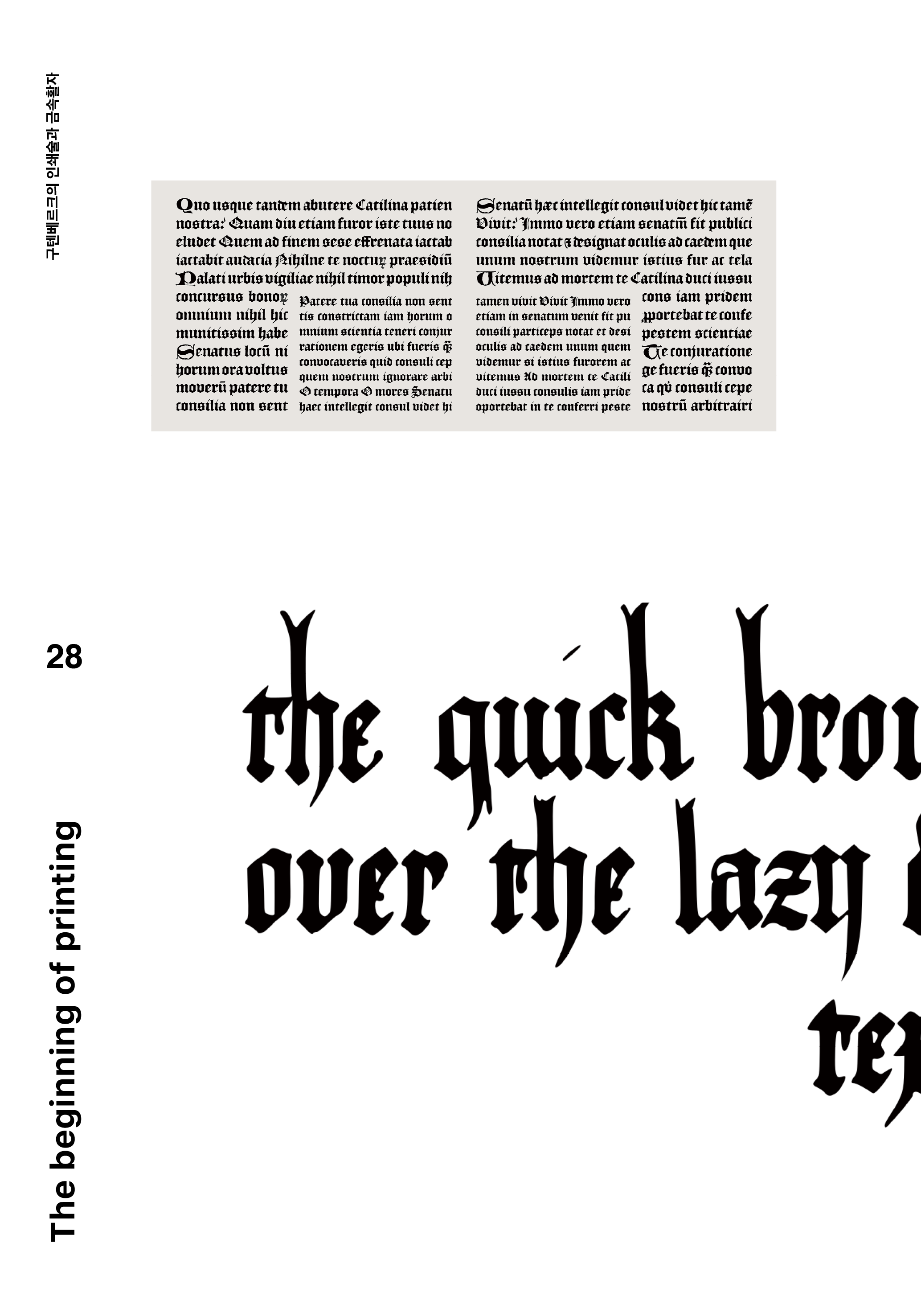
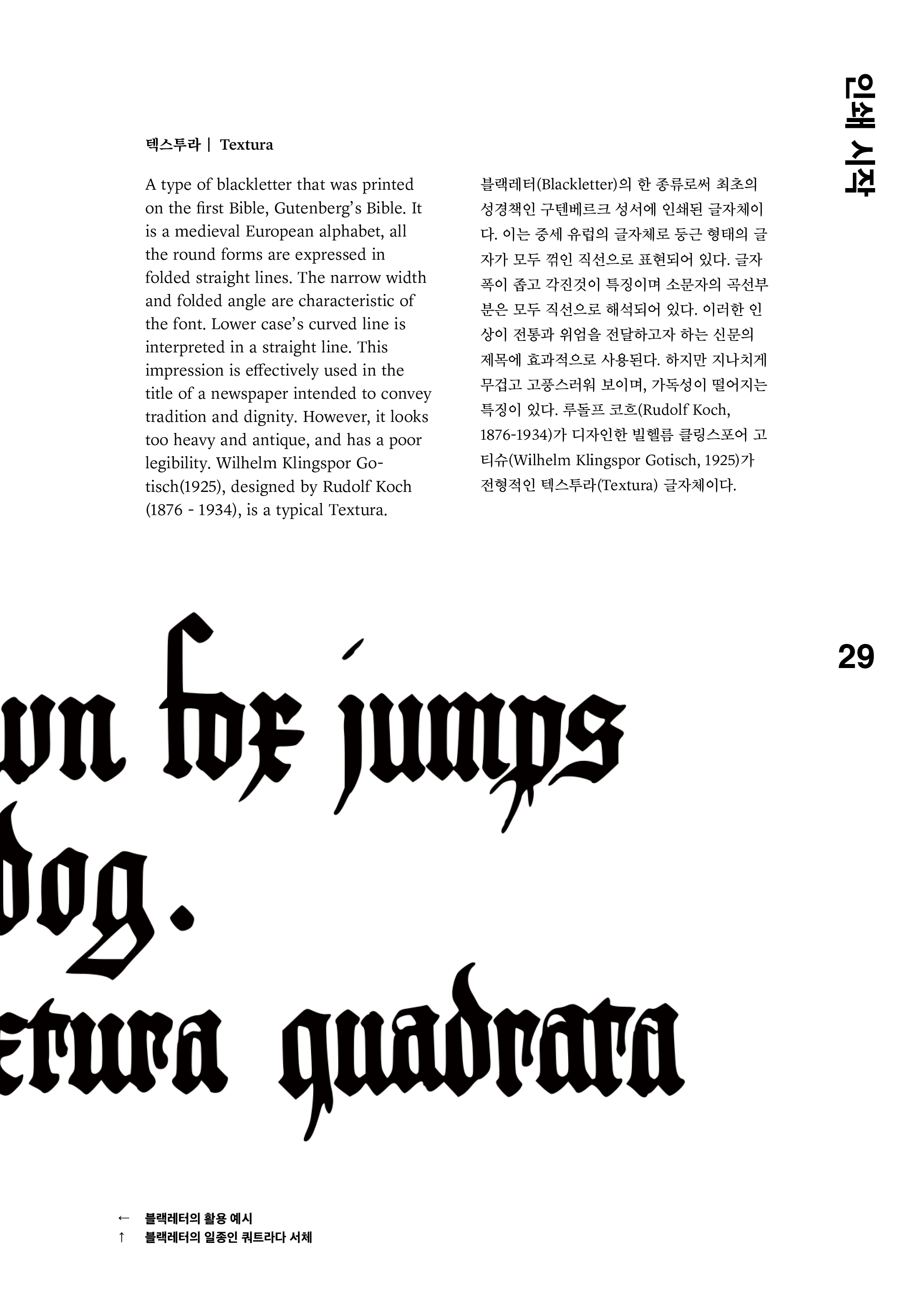
먼저 로마 시대에는, 글자를 돌에 조각하여 사용하였습니다. 손으로 돌을 깎아 만든 활자체를 만드는 기술을 시작으로 구텐베르크의 인쇄술과 금속활자를 발명하면서 활자화가 극적으로 발전했습니다.
종교용 인쇄물이나 국가에 필요한 자료를 인쇄하는 등 이 시기에 인쇄술은 폭발적인 성장이 일어났습니다. 이후 타이포그래피는 디지털 기술과 컴퓨팅의 발전 등 다양한 기술을 바탕으로 발전해 왔습니다.
종교용 인쇄물이나 국가에 필요한 자료를 인쇄하는 등 이 시기에 인쇄술은 폭발적인 성장이 일어났습니다. 이후 타이포그래피는 디지털 기술과 컴퓨팅의 발전 등 다양한 기술을 바탕으로 발전해 왔습니다.
During the first Roman period, typography techniques were often carved into stone. Starting with the technique of making typefaces, which are made by cutting stones by hand, typography has developed dramatically through the invention of Gutenberg's printing and metal type.
Explosive growth occurred during this period, including printing religious-use prints or materials needed in the country. Since then, typography has been developing as various technologies, including the development of digital technology and computing.
Explosive growth occurred during this period, including printing religious-use prints or materials needed in the country. Since then, typography has been developing as various technologies, including the development of digital technology and computing.

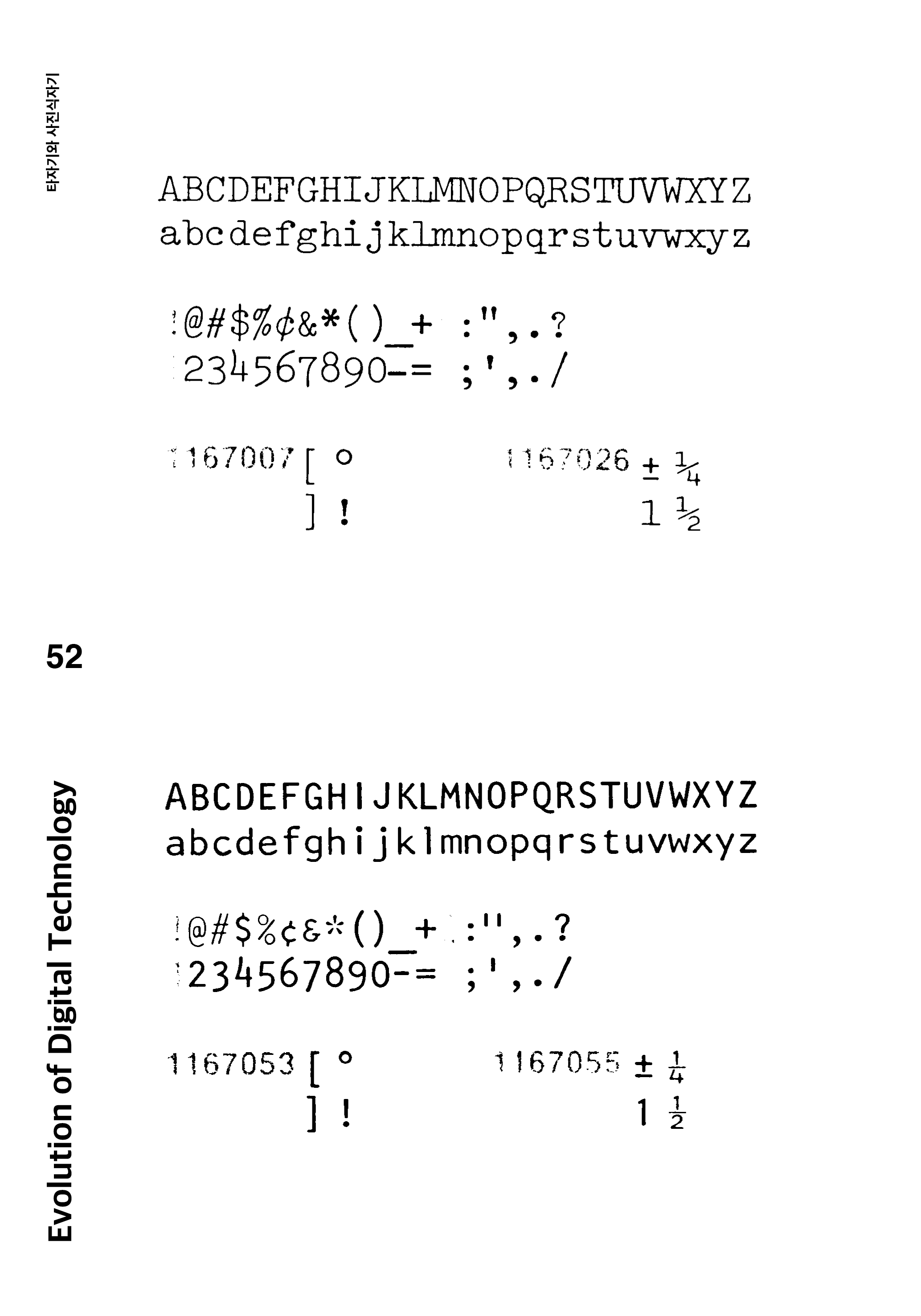
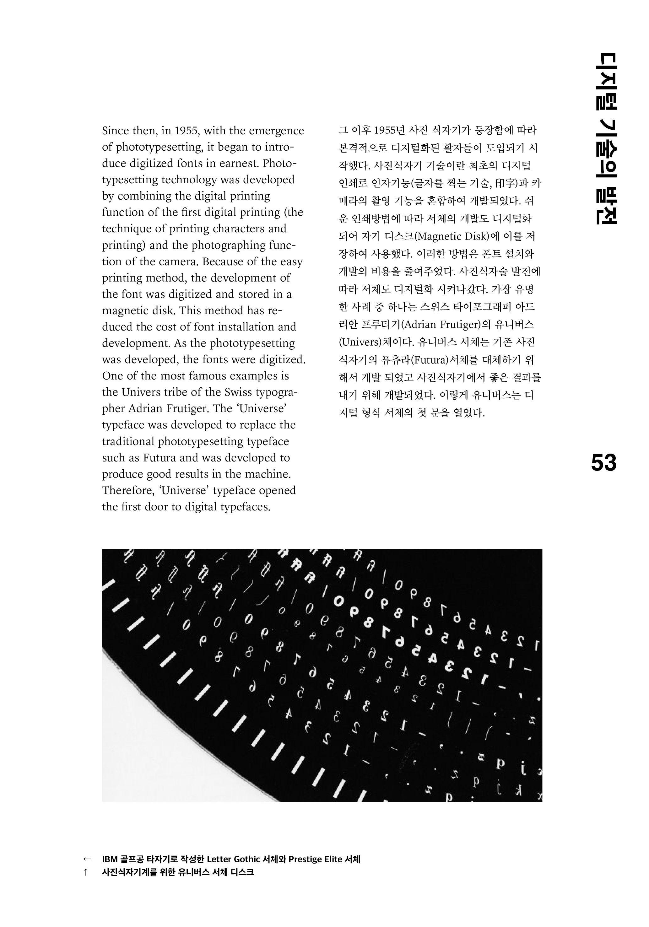
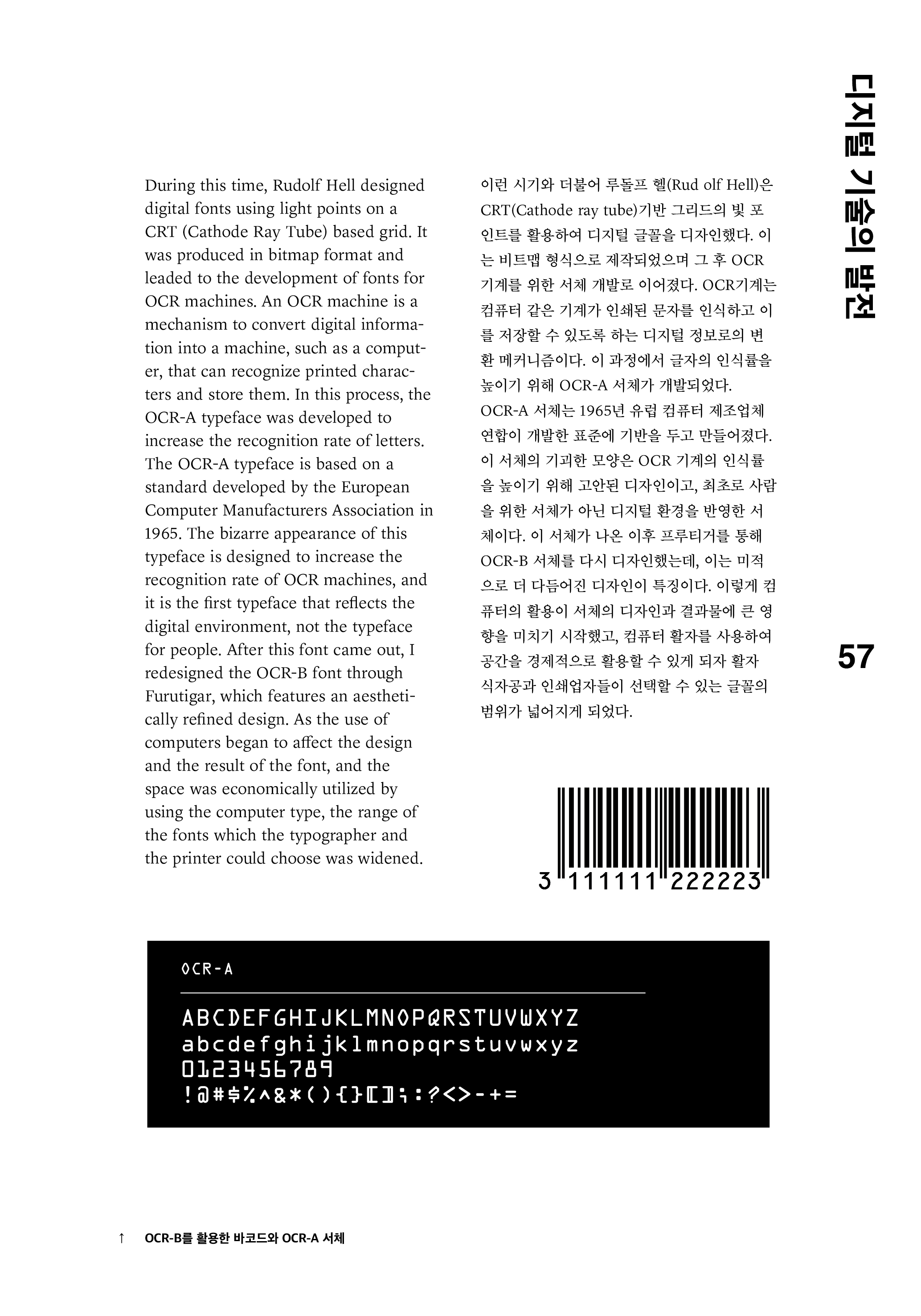
1955년, 포토타입 세팅이 등장하면서 본격적으로 디지털화된 글꼴이 도입되기 시작했습니다. 포토타입 세팅 기술은 최초의 디지털 인쇄로써 디지털 인쇄 기술과 카메라의 사진 촬영 기능을 결합하여 개발되었습니다. 인쇄가 이전보다 비교적 쉽기 때문에 개발된 글자들이 디지털화되어 자기 디스크에 저장되었습니다.
In 1955, with the emergence of phototypesetting, it began to introduce digitized fonts in earnest. Phototypesetting technology was developed by combining the digital printing function of the first digital printing (the technique of printing characters and printing) and the photographing function of the camera. Because of the easy printing method, the development of the font was digitized and stored in a magnetic disk.
컴퓨터의 사용이 글꼴 디자인에 영향을 주기 시작하고, 물리적 공간을 효율적으로 활용할 수 있게 되면서 인쇄할 수 있는 글꼴의 범위가 넓어졌습니다.
개인용 컴퓨터가 개발된 후, 스티브 잡스는 수잔 케리와 함께 균형감각이 뛰어난 아름답고 예술적인 비트맵 폰트를 디자인했습니다. 그리고 나서 매킨토시에 탑재된 글꼴은 미국 도시의 특성을 반영하여 디자인되었습니다. 그 이후로 Microsoft, Apple 및 Adobe는 서로 다른 응용 프로그램에서 사용될 글꼴들을 개발하기 시작했습니다. 1996년에 Adobe는 개발된 서체들을 하나로 통합하고 공통적인 포맷을 개발했습니다. 이는 지금까지도 널리 사용되는 OpenType 형식입니다. 이러한 포맷의 통일은 디지털 서체에 혁신을 가져다주었고 혁신적인 통합과 발전하는 기술은 이전에 없던 우수한 타이포그래픽 디자인으로 이어졌습니다.
개인용 컴퓨터가 개발된 후, 스티브 잡스는 수잔 케리와 함께 균형감각이 뛰어난 아름답고 예술적인 비트맵 폰트를 디자인했습니다. 그리고 나서 매킨토시에 탑재된 글꼴은 미국 도시의 특성을 반영하여 디자인되었습니다. 그 이후로 Microsoft, Apple 및 Adobe는 서로 다른 응용 프로그램에서 사용될 글꼴들을 개발하기 시작했습니다. 1996년에 Adobe는 개발된 서체들을 하나로 통합하고 공통적인 포맷을 개발했습니다. 이는 지금까지도 널리 사용되는 OpenType 형식입니다. 이러한 포맷의 통일은 디지털 서체에 혁신을 가져다주었고 혁신적인 통합과 발전하는 기술은 이전에 없던 우수한 타이포그래픽 디자인으로 이어졌습니다.
As the use of computers began to affect the design and the result of the font, and the space was economically utilized by using the computer type, the range of the fonts which the typographer and the printer could choose was widened.
After personal computer was developed, Steve Jobs hired Susan Kare to design a beautiful, artistic bitmap font with a good sense of proportion. The fonts designed by Susan Kare for the Macintosh were then designed to reflect the character of many American cities. Since then, Microsoft, Apple, and Adobe have begun to develop fonts with different applications. In 1996, Adobe integrated it and developed a common format, which is now in the form of a font. This is called the OpenType format. This type of unification has revolutionized digital typefaces in a cross-platform style. This revolutionary integration and functionality has enabled unprecedented stylish and excellent typographic design.
After personal computer was developed, Steve Jobs hired Susan Kare to design a beautiful, artistic bitmap font with a good sense of proportion. The fonts designed by Susan Kare for the Macintosh were then designed to reflect the character of many American cities. Since then, Microsoft, Apple, and Adobe have begun to develop fonts with different applications. In 1996, Adobe integrated it and developed a common format, which is now in the form of a font. This is called the OpenType format. This type of unification has revolutionized digital typefaces in a cross-platform style. This revolutionary integration and functionality has enabled unprecedented stylish and excellent typographic design.


다양한 디지털 글꼴이 등장하기 시작하면서 디자이너와 글꼴 개발자들은 한 서체 안에서 여러 두께와 스타일의 글꼴을 만들기 시작했습니다. 특히 모바일과 웹을 위한 디지털 폰트 제품군이 이러한 특징을 가지고 있습니다. 과거에는 글꼴 두께를 다르게 만들기 위해 개발자들이 하나씩 글꼴을 디자인했지만 최근에는 글꼴 스타일을 제작해 주는 프로그램과 소프트웨어의 활용으로 다양한 글꼴을 쉽게 디자인하고 적절하게 사용할 수 있게 되었습니다.
As various digital fonts began to emerge, designers and font developers began to make fonts of different thicknesses and styles in a single family. Especially, the basic family of digital fonts for mobile and web are very diverse. In the past, the developers designed the fonts one by one in order to make the thickness of the fonts different, but in recent years, programs and software that make the fonts vary in thickness have made it possible to easily design various fonts and use them appropriately.